Crimsafe Brand Evolution
Crimsafe has been committed to safety since 1996, and to continue our success, we need to grow and evolve as a business.
We’ve refreshed our logo, giving it a more modern and approachable look. This evolution reflects our strength and our growing global presence, while also providing greater clarity and flexibility in digital environments.

Our Purpose
Our refined mission and purpose as a business is to 'Make the world a safer place.'
We believe there’s a strong opportunity for us to extend our offer to encompass a broader meaning of ‘safety.’ We are committed to delivering safer ways for people to live, work, build, and create communities.
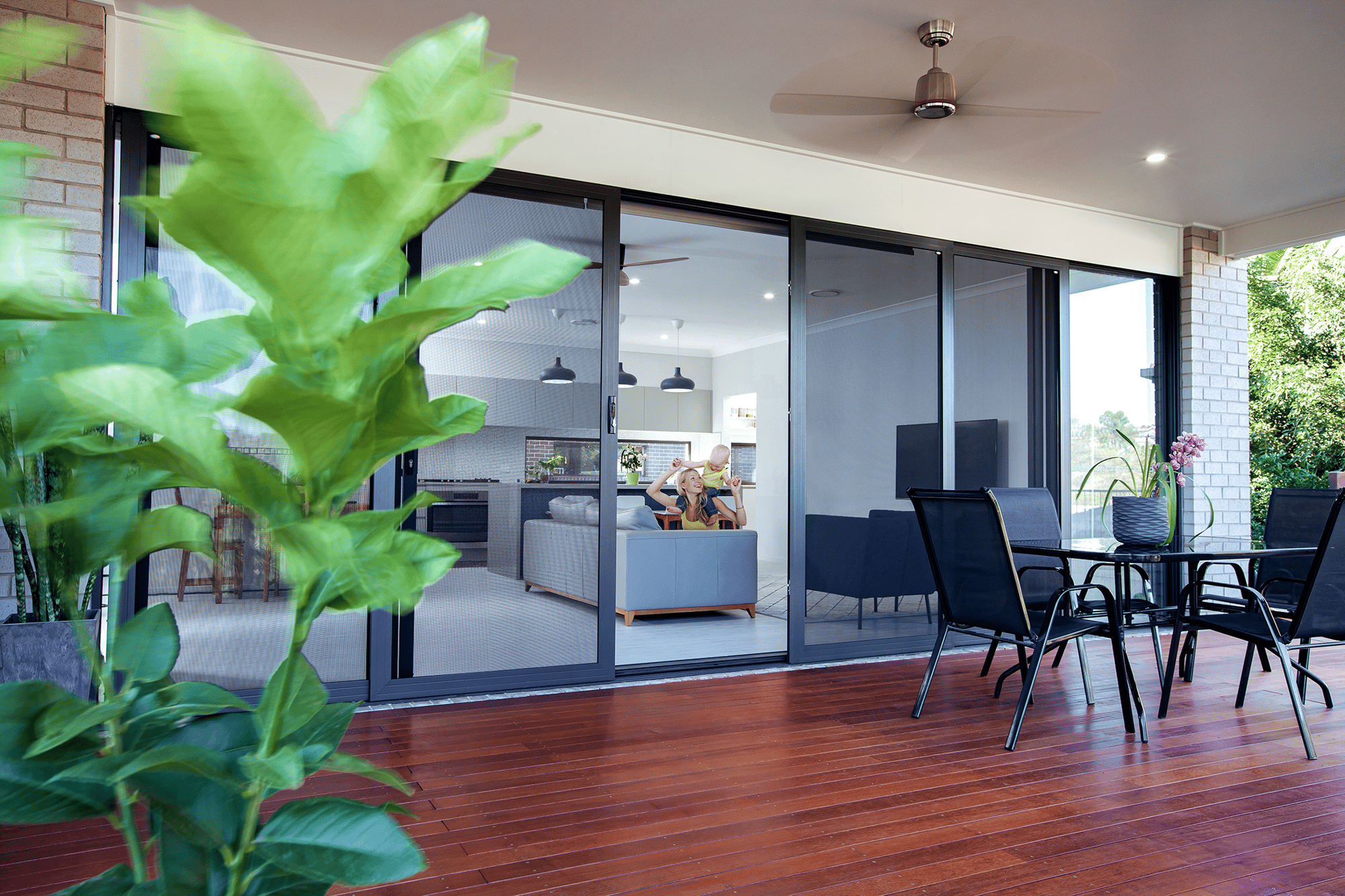
Our security solutions are superior in strength, quality, and innovation, ensuring our customers can feel safe in their homes and communities.

Crimsafe's Brand Evolution
A New Chapter in Safety
Our brand evolution brings out the best of our iconic identity and sets us up for a bright future, allowing
us to continue making the world a safer place. Since 1996, Crimsafe has been synonymous with safety
and security. To ensure our continued success and growth, we are evolving the Crimsafe brand to take
advantage of new opportunities and better serve the Crimsafe Group and our global audience.
Digital First: Modern and Distinctive
As part of our brand evolution, we have refreshed our iconic logo to reflect a more modern distinctive look. This change highlights our strength and expanding Crimsafe Group while providing greater clarity and flexibility in digital formats. Our commitment to safety remains steadfast and our brand evolution ensures we are ready for the future.
Vibrant and Bold: Enhanced Visual Identity
Our colours remain true to Crimsafe’s legacy but are now more vibrant, enhancing their impact in digital applications. The font has been updated to be bolder and more authoritative, giving our brand more flexibility and improving legibility across all platforms.
Simplified Strength: Improved Usability
The holding ellipse in our logo has been simplified. This change improves usability, demonstrates our brand's strength, and provides clarity and consistency across all applications. These updates ensure that our visual identity is cohesive, clear and instantly recognisable, no matter where it appears.
Living Safer: Our Brand Promise
While "If it’s not Crimsafe, it’s not crim safe" remains our distinctive tagline for consumer marketing, our new brand promise, "Living Safer," allows us to showcase our holistic approach to safety and security. This new tagline embodies our commitment to providing security across all our products and brands, ensuring that everyone is living safer.
Strengthening Our Leadership Position
The Crimsafe brand is not just evolving; we are reinforcing our leadership position in the safety and security industry. Our refreshed identity represents our ongoing commitment to innovation, quality, and excellence. By modernising our brand, we are better positioned to lead the market and set new
standards in safety and security solutions.
Looking Forward
As we continue to grow as a business, our brand will evolve with us too. The refreshed Crimsafe logo aligns with our renewed business strategy and helps communicate our strength and global brand footprint. We are excited about this new chapter and look forward to continuing our mission to make
the world a safer place.
Thank you for being a part of the Crimsafe journey. Together, we are "Living Safer.
Our Brand Evolution Story
Everyone deserves to feel safe where they live, work, learn, travel and enjoy the world. That's why we are committed to developing and delivering solutions wherever they are.
We are making the world a safer place.

